
Morning light can make the same slab feel cooler
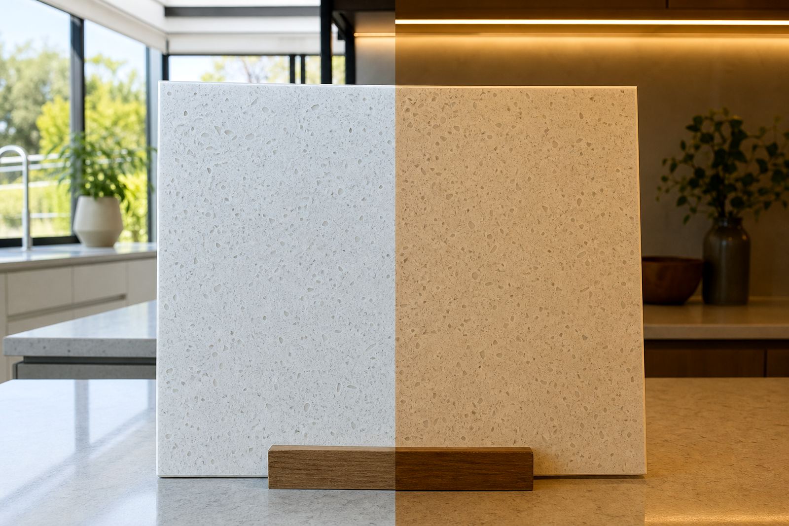
Natural light is rarely neutral in a real room. A north-facing kitchen in Sandton can carry a bright, pale wash by late morning, while a west-facing braai room in Fourways may pick up warmer colour later in the day. That shift affects how a white quartz top reads, and it also changes the way a soft grey solid-surface vanity feels under the eye.
Engineered quartz usually carries fine movement or a tighter speckled pattern, while solid-surface sheets often read as flatter and more uniform. Under strong daylight, the difference in tone becomes easier to spot, especially on larger runs where seams, sink cut-outs and edge profiles sit close to each other.
- Check the slab near a window, not only under shop lights.
- Look at it beside the actual wall colour and floor finish.
- Ask how the surface looks at midday and late afternoon.
Lighting temperature changes the colour story
Warm white downlights, cool white LEDs and mixed daylight do not show a surface in the same way. A light cream quartz top can feel clean and airy under cooler fittings, then drift toward yellow next to warm globes. Solid-surface colours with a subtle pearl effect can also look more or less visible depending on the lamp type above them.
That is why templating should happen after the site lighting is in place where possible. In a Randburg home with fitted cabinets and pendant lighting over the island, the final surface choice is often clearer once the room is lit as it will be used. The same applies to reception counters in offices where the light is controlled and the finish needs to stay consistent from front to back.
When we plan a job, we consider:
- lamp colour and fitting height
- window direction and glare
- adjacent paint, tile and cabinetry tones
- how much shadow the edge profile will throw
Gloss, matte and the way fingerprints show
Sheen changes how light bounces off a top. A polished quartz finish reflects more and can look brighter in a small room, but it may also show strong reflections from under-cabinet lighting. A satin or matte solid-surface finish softens that effect, which can suit a bathroom vanity or a calm office tea point where glare is not welcome.
Fingerprints, water marks and dust are also more visible on some colours than others. Darker tops can show every mark under direct light, while very pale tops may show the shadow of crumbs or make edge joints stand out if the room is dim. For shopfitters, that matters when a countertop sits beside display lighting and the client wants the finish to look tidy from the customer side.
- High gloss suits brighter rooms with careful lighting control.
- Matte finishes hide small marks better in busy spaces.
- Mid-tone colours often balance glare and visible dust.
Edges, seams and sink cut-outs need the right light
Light can be unforgiving where the work is joined. A seam that is properly set and colour matched can still catch the eye if a beam of light lands across it at the wrong angle. The same goes for a sink cut-out or hob opening. Straight lines, tight corners and clean polishing show more clearly when the room is bright.
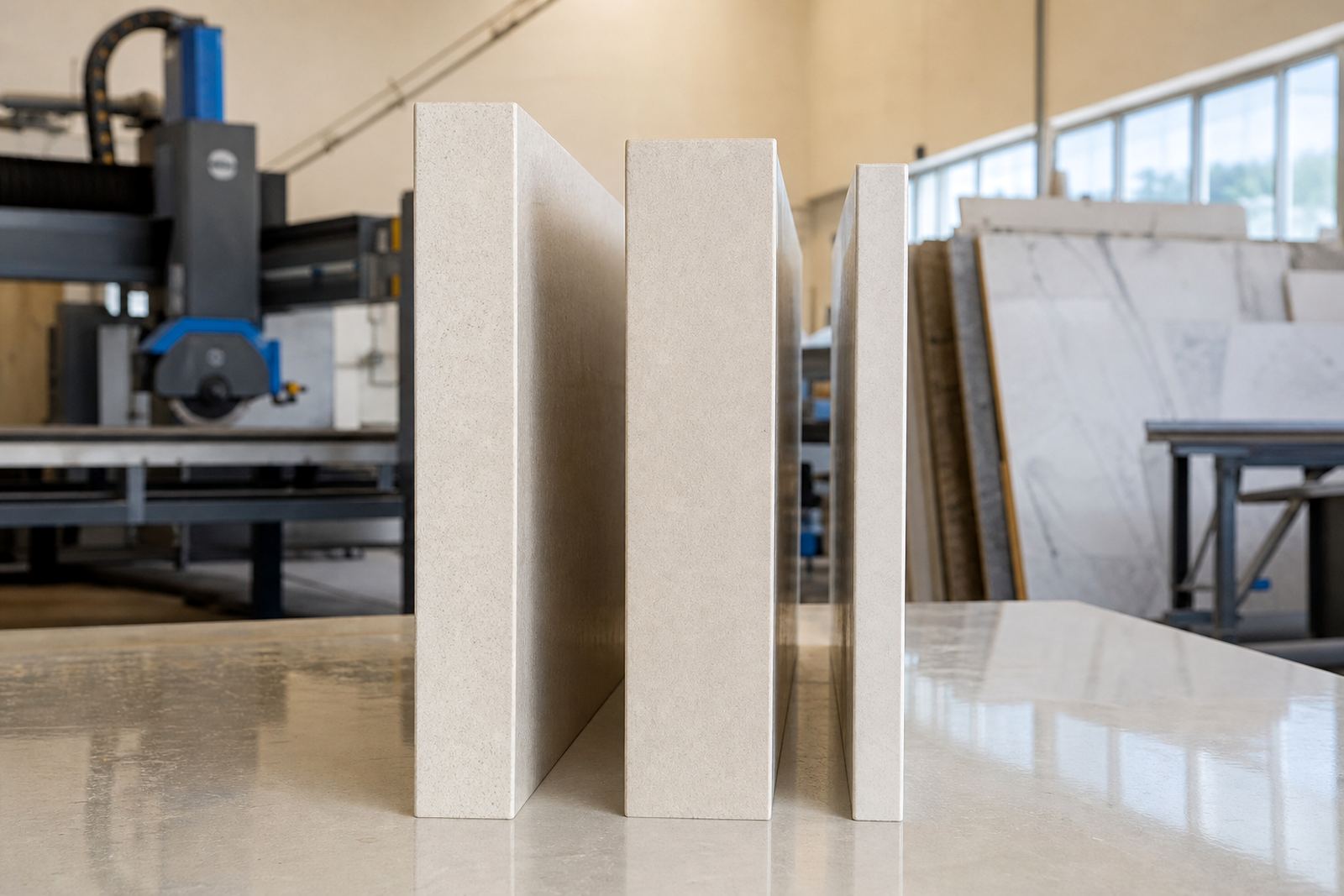
Edge profiles also change the way a top reads. A square edge gives a crisp, modern line, while a slight bevel or soft pencil edge can break the glare on a reflective surface. In practical terms, the right profile depends on the cabinetry, the wall finish and how much visual weight the client wants the top to carry.
Good detailing includes:
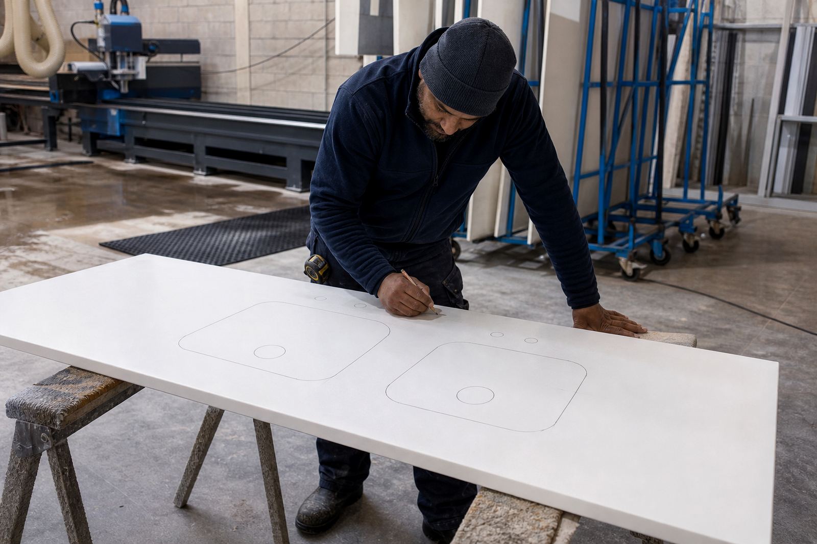
- accurate site templating before cutting
- careful slab layout so patterns sit where they should
- planned seam positions away from the most visible sightlines
- neat polishing around sink and hob cut-outs
A Pretoria vanity tells a different story at night
A bathroom in Pretoria may feel calm and even by day, then take on a different character at night under a pair of wall lights. In that setting, a pale solid-surface vanity can appear smoother and cleaner, while a quartz vanity top with fine patterning may pick up more contrast. The room still works, but the choice of colour and finish changes the mood.
This is where aftercare advice matters too. Darker surfaces need gentle cleaning to avoid streaking, and both quartz and solid-surface tops should be protected from harsh abrasives. Heat from pots should never go straight onto the surface, and spills like wine, coffee or cosmetic dye should be wiped up without delay. In kitchens with generous glass doors or skylights, a protective habit becomes part of daily use.
Our aftercare advice usually covers:
- safe cleaners for polished and satin finishes
- how to avoid heat marks and dull patches
- what to do when a spill sits on the surface
- how seams and joins should be kept clean
Lighting checks before installation save awkward surprises
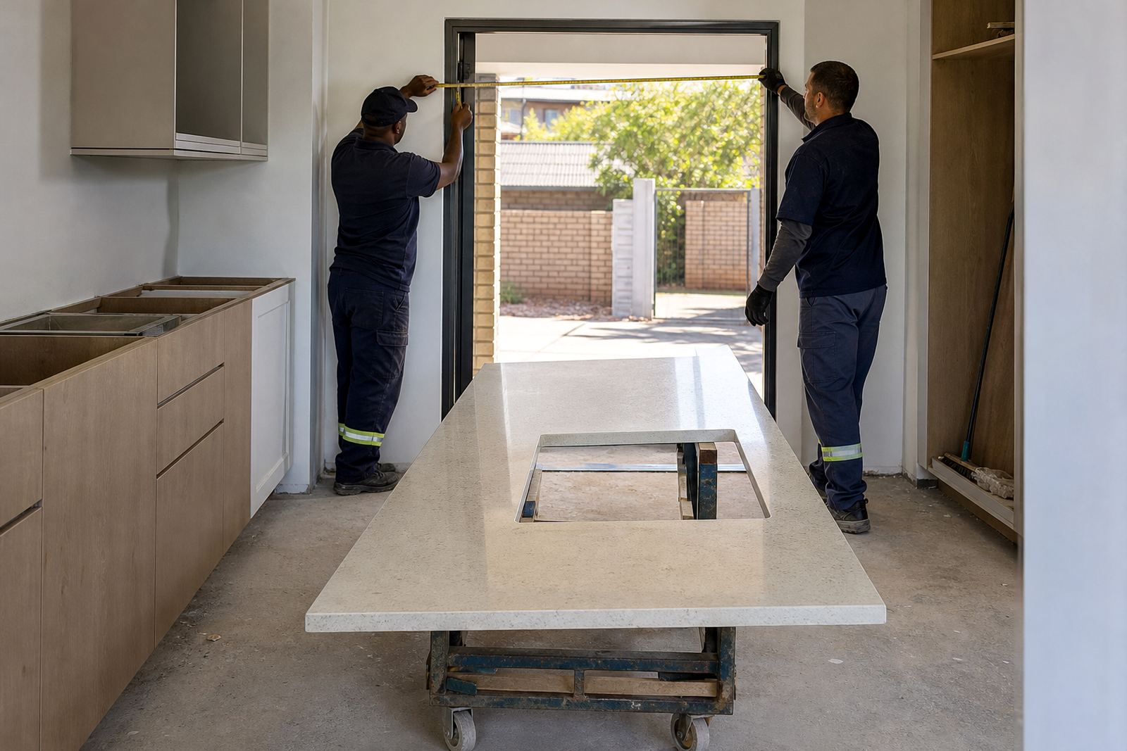
There is no substitute for seeing the top in the room before final installation. Digital measuring and site templating help us set the dimensions, but the light still needs to be checked against the material. A surface that looked soft in the workshop may appear brighter in a showroom with different lamps, or vice versa once it reaches a kitchen in Midrand with wide windows and pale tile.
For contractors and homeowners alike, the useful step is to compare the selected slab with the actual room conditions, not a memory of a sample. Our work across Gauteng includes kitchen tops, vanity units and splashbacks for homes, offices and shopfitters, so the same material can be asked to do very different jobs. Good lighting planning makes that job easier from the start.
It helps to confirm:
- where the strongest daylight enters the room
- which lights stay on for evening use
- whether the wall colour is final or still changing
- if the top needs to read lighter or darker in use
When light changes, the room still has to work
Colour perception is never fixed. A countertop in Strijdom Park, Randburg may be fitted in a bright workshop environment, then look softer once it sits under cabinet lights and next to real appliances, taps and stools. That is normal, and it is why careful planning matters more than a quick glance at a sample.
Plastone handles templating, cutting and installation with that shift in mind. Whether the job is a compact vanity, a long kitchen run or a splashback that must sit neatly behind the hob, the aim is the same: a surface that makes sense in the light it will live in. If the room changes through the day, the top should still feel right when the lights go on and the blinds are drawn.